AVI
My website code stuff
Project maintained by Locust0 Hosted on GitHub Pages — Theme by mattgraham
Aesthetics
December 2, 2018
So, at some point I’ll need to pick an aesthetic for the game. Ideally, its fairly minimalistic (because I’m only really a programmer) while also meshing with the nature themes of the game. The following are some images which I don’t own but could help act as an inspiration for the aesthetic.
Soma’s Beauty
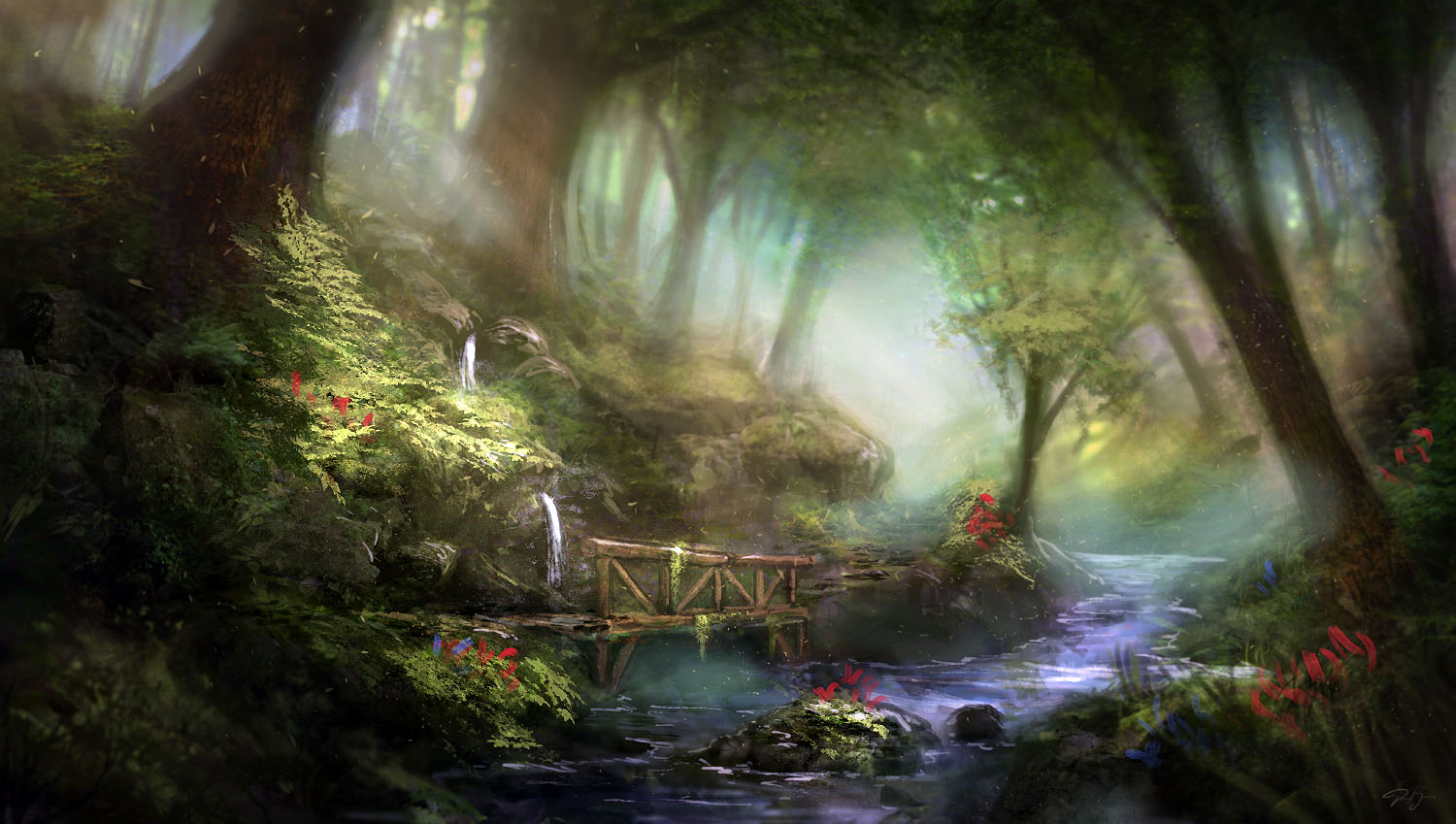
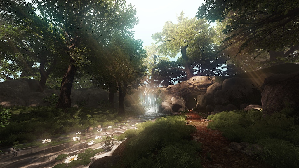
The look of the final area in Soma is simply amazing. Its super short and small but looks absolutely fantastic. Ideally, I could make a game that looks that good but given my lack of experience with environment design I’m not sure how realistic this look is. Either way, these pictures serve as an excellent “best case scenario” for how the game looks.
Here is some dreamy concept art:
Here is the ark in game:
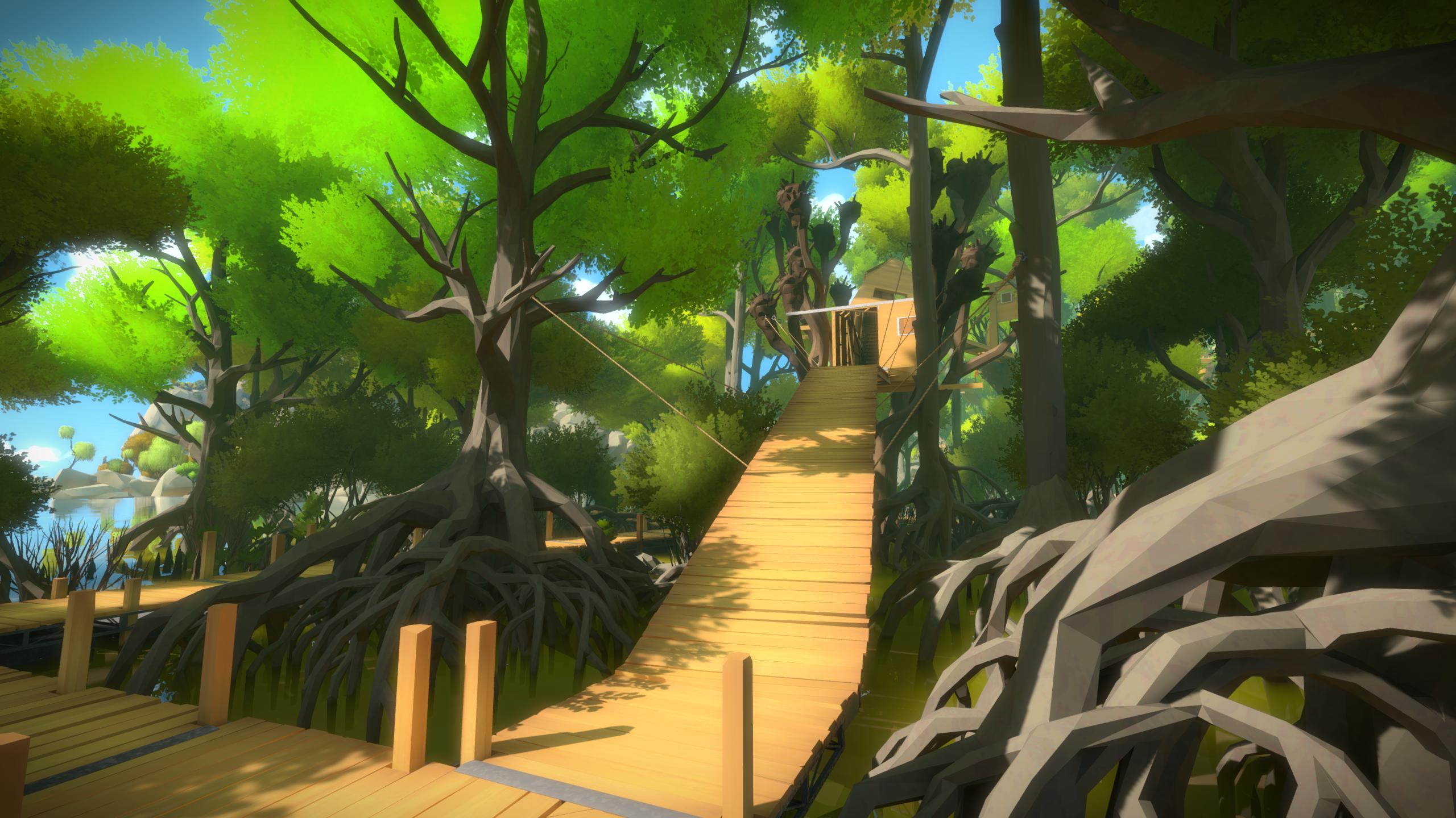
The Witness’ Minimalism
The witness is a very good-looking game given that it was made by 3 artists instead of a small team like with Soma. I don’t think their aesthetic would work but I love how minimalistic everything looks. Ideally, I can avoid those straight polygon edges everywhere.
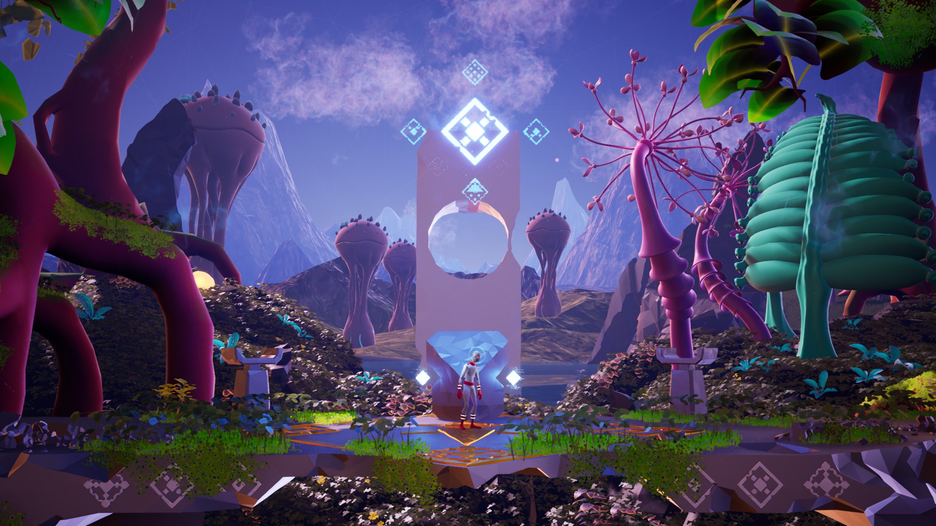
Planet Alpha’s Mix of Hard Edges and Smooth Surfaces
Before seeing this game, I didn’t think you could so beautifully mesh hard lines for terrain and interesting foliage on it. It looks stunning and gives me hope I could make something like this work.
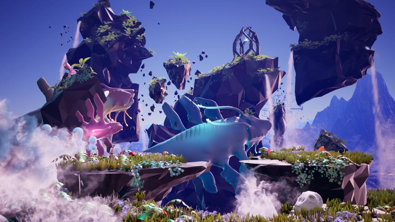
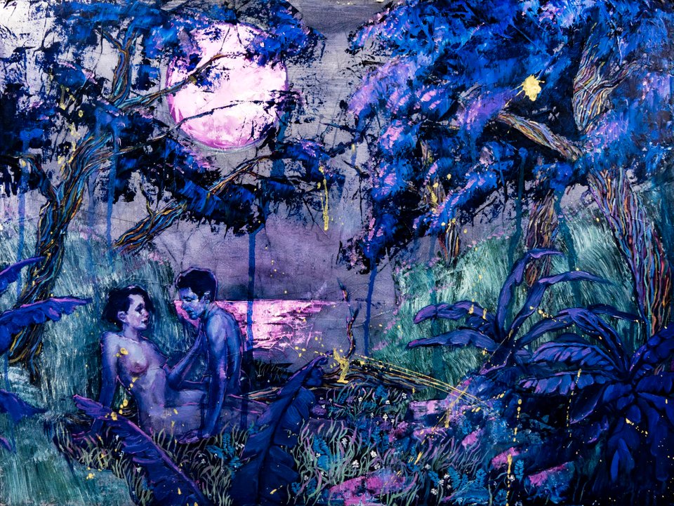
The Stunning Color Palette of this Art
Honestly, when I first saw this, I was completely drawn in by the blues, purples and pinks of this image. It looks absolutely amazing and I wish I could make an equally awesome color palette work in a game. It’s all so bold and beautiful.
